ShopDreamUp AI ArtDreamUp
Deviation Actions
Daily Deviation
Daily Deviation
May 31, 2009
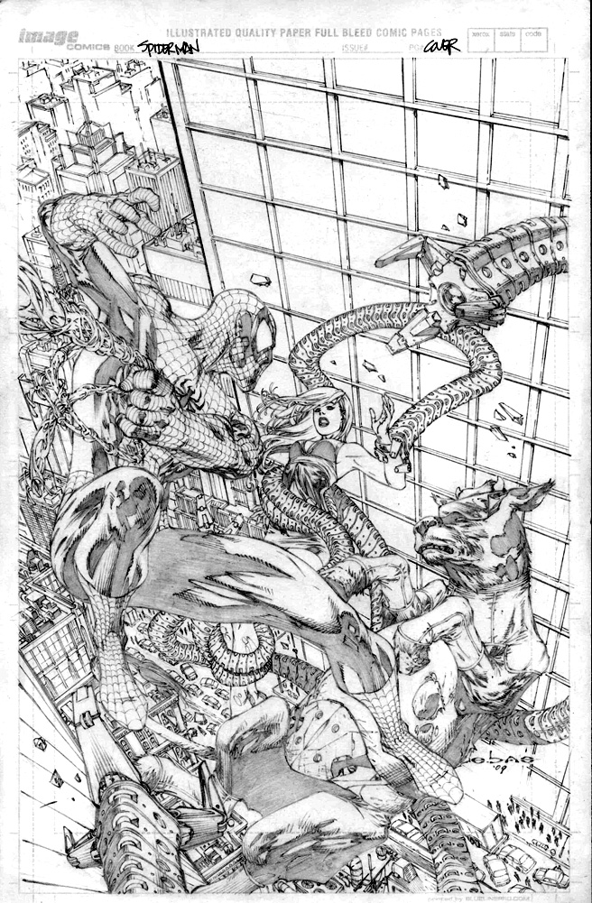
spiderman by ~ebas An excellent example of a piece that doesn't need colors to be stunning! Incredibly detailed background, good use of perspective and expressions.
Featured by Thiefoworld
Suggested by Hellobaby


Suggested Deviants


Suggested Collections


You Might Like…


Featured in Groups

Description
this is obviously a cover for spiderman, but im not sure im suppose to be posting this yet..so can all you refrain from posting it on other sites at least for a month or three??
i gotta say i loved and hated drawing this cover for oh so many reasons...i love marvel, they were my fav publisher growing up. and i still buy their books to this day...so its always fun to draw their characters. but spidey was such a pain in the ass to draw. ...he is now (to me) the second hardest character to draw in comics after our very own "Darkness"...
spiderman is structured oppsite of the way i draw my super hero men..in some subtle ways i threw lines in the opposite contour than i normally would've. like spidey's trisep on his right arm (our left) is drawn inward rather than out..drawing muscles outward makes character looks bigger and spidey is a very slender and elongated person. i also gave him bigger knuckles a la "joe mad" and longer limbs, slightly bigger head, smaller waist and broader shoulders, really narrow ankles...all these are things i've never drawn on a guy before but all these things make him unique looking. kinda like drawing the hulk, he has wide ankles and...well wide everything....but prob most distinct is his small nose and really long filtrim (crevus between nose and top lip)again...all things that make a character look unique. it should give the viewer the feeling that this character is diff for a specific reason... in this case, to make you feel that spiderman can flip, jump and bend in the ways he can....now if drawn with a normal super hero's physique might make you feel that he's not that agile.
i've never drawn a cow and to be asked to draw a cow on a cover to look like a villain AND look cool...just is ridiculous...but hey i like a challenge. my internet is down right now, so i didnt have google to save my hide to look up cow ref, so i had to wing it. oh well..this may sound stupid but i didn't know doc oct had only 4 robotic arms...never really counted...i assumed he had 8. duh...as much as a pain in the ass as all those individual links were to draw and bending and twisting... it was worth it in the end. i think they look cool, like in the movie.
my boss had a problem with my layout...he said that there was a huge tangent in that everything in the image was all leading your eye in the same downward angle, and that all their heads were aligned....in my head i was like...duh...there's all falling....what other way can you fall if not down?? i actually didnt get it...and he told me that if i changed the background it might help...and he was right...it countered the massive movement in the figures...the big building was originally behind spidey and going in the opposite direction...
i remember going up the elevator with my boss Mr Marc Silvestri talking about how he hated drawing the webbing on his costume, and i was like eh..it's not that bad....BOY was i wrong...not only is it weird that all the webbing hangs upside down against gravity, all of it is in perspective...yet another hard and annoying thing about him..
even in something as action packed as this is or the idea/design...there's still ways to make it look stiff and boring... and i find that using a few tricks help eliminate that, are foreground elements, such as the much larger claw at the bottom left...or the web coming at us rather than straight to the side...on upper left side...things like this add a lot of depth and as some of you loyal watchers hear me say "eye candy" plus it sometimes works as framing tools.
i got to a point when i was done drawing the figures that i was sick at looking at this and wanted to get it over with...and turn it in backgroundless...even though the layout had a whole city in it... i went to marc and asked him what he would do...i personally thought it was busy enough without all the buildings....but we both listened to out guts and i added it in anyway....in the end im happy with the outcome and it doesnt look to busy or clash with the figures...
i actually did a NO NO when drawing the background...i didnt use a vanishing point which i DO NOT recommend...i took the lazz approach and eye balled the perspective and got pretty lucky...most of it lines up...and dont pull a ruler to ur screen pls...
its very hard for me sometimes to hold back on the detail as i love drawing it...i really wanted to draw the reflection and shine that clean windows have....but if i had drawn the shine behind the building of doc oct, it woulda plugged in all the wholes space and made it very cluttered...i know brain hitch woulda drawn the shine, along with the windows in the buildings in the far upper left...they are not there to add the illusion of depth... and help fade out the backgorund for distance....but i have to hold back because i know its right...
its hard for me to draw small, so maryjane's expression was a challenge
you know there are many ppl out there that think i only know how to draw tits and ass ....(mmmm, ass) and i was happy to draw this cover to show some of those nay sayers that its not all im capable of...this is anything but T and A
again there is no ass on here and i love to respesent...oh well
GO ASS!!!
Image size
656x1001px 386.54 KB
© 2009 - 2024 ebas
Comments271
Join the community to add your comment. Already a deviant? Log In
I don't know whether I like your drawing or your explanation better. Thanks for both!